My go-to tool for transit travel time calculations has been Melinda Morang’s Add GTFS to a Network Dataset (AGtND) software. It’s an add-in for ArcGIS that allows you to run standard network analyses for transit systems, using any publicly available GTFS feeds and assuming you can generate a reasonable pedestrian network to facilitate boardings and alightings.
I wanted to do some validation of the results I’ve been getting out of Arc by comparing AGtND to estimated travel times from Google Maps. In principle they should be the same. My instinct was to use Python to query one of the Maps APIs, but I’m not quite as bilingual as I’d like, so I did the same in R.
Hadley Wickham has a package httr that makes the job easy. The GET() command queries an API and returns the result in JSON that can be easily parsed using content(). Add in lubridate and it’s easy to tell Google to grab travel times for specific instants. I created a loop over the Distance Matrix API to generate travel times by transit.
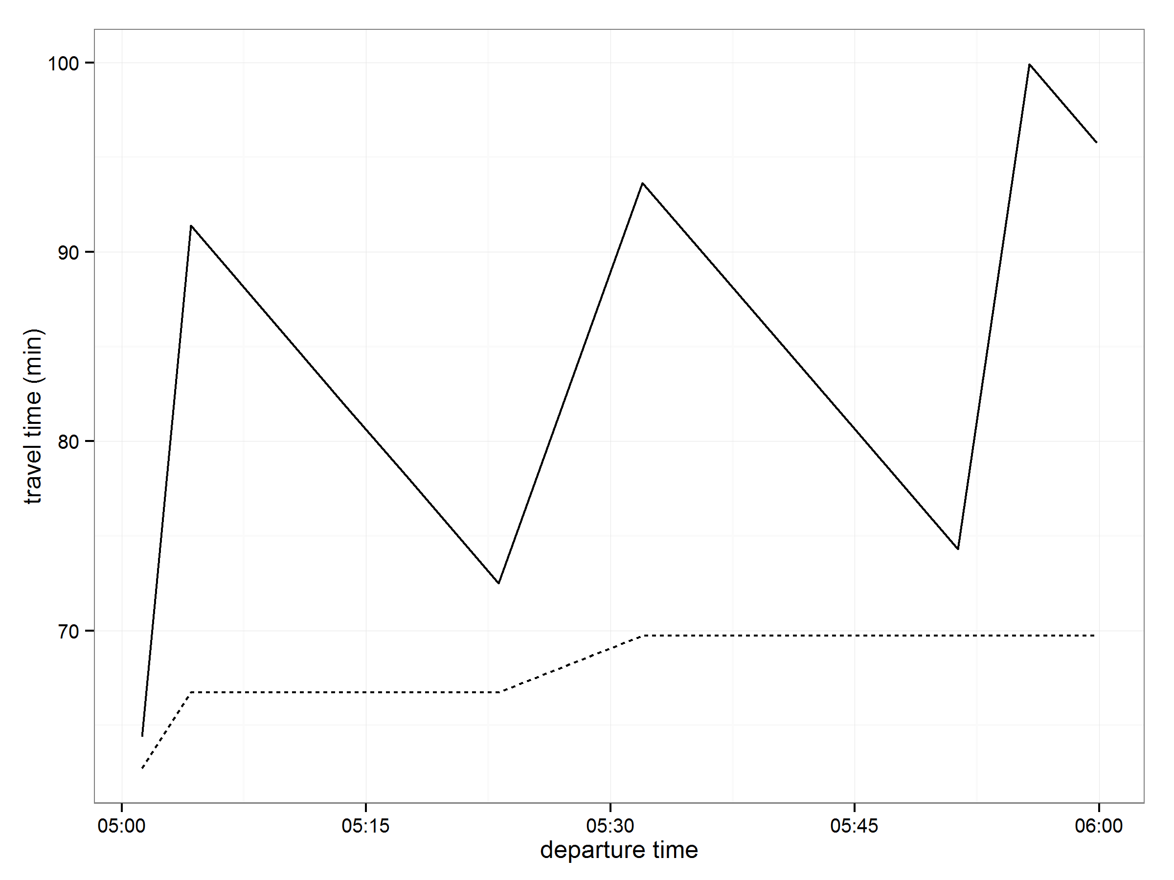
One important property of AGtND makes its reported travel times different from those calculated from Google Maps. Namely, AGtND assumes that the traveler departs at precisely the specified time. This means that, if you’re trying to catch a bus and you’ve just missed the departure closest to your house, you’ll still walk along the route until the next bus comes by, regardless of whether that makes sense when thinking about the actual headway. This can add quite a bit of travel time. Google Maps, on the other hand, knows that you’ll probably want to wait for the next departure before embarking on your journey, so it holds the traveler at home until they should leave to conveniently catch the next bus - i.e. it minimizes waiting time. This means that, in general, the travel times generated from Maps will tend to be quite a bit lower than those generated by AGtND. This is illustrated in the figure below, where we’re looking at a single OD pair with travel times calculated at randomly occurring five minute intervals between 5am and 6am. The solid line represents those times calculated using AGtND and the dashed line represents those from Google Maps.

The ESRI-calculated time approaches, but never reaches the Google Maps time. This residual difference could be due to the way walking time is treated in both cases. Google varies walking times dynamically, based on topography. I set a constant walk speed (5 km/hr) to use with ArcMap.
In my calculations of the expected travel time during this one hour interval based on the ESRI results, I’m going to want to assume something other than the mean, or else I’ll be substantially overestimating the travel time that a typical transit user would experience.